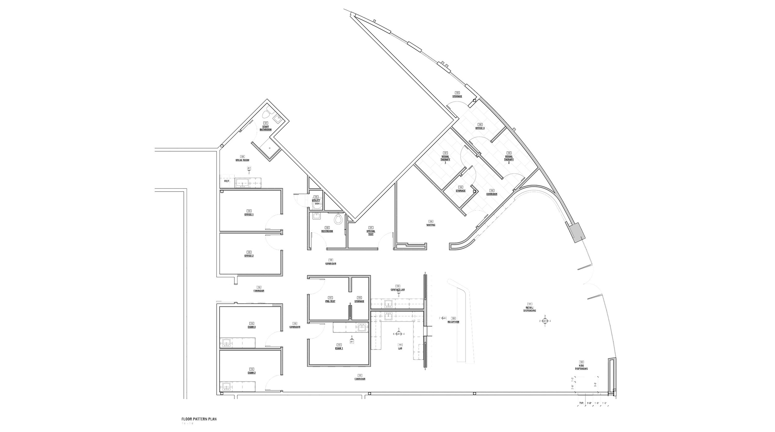
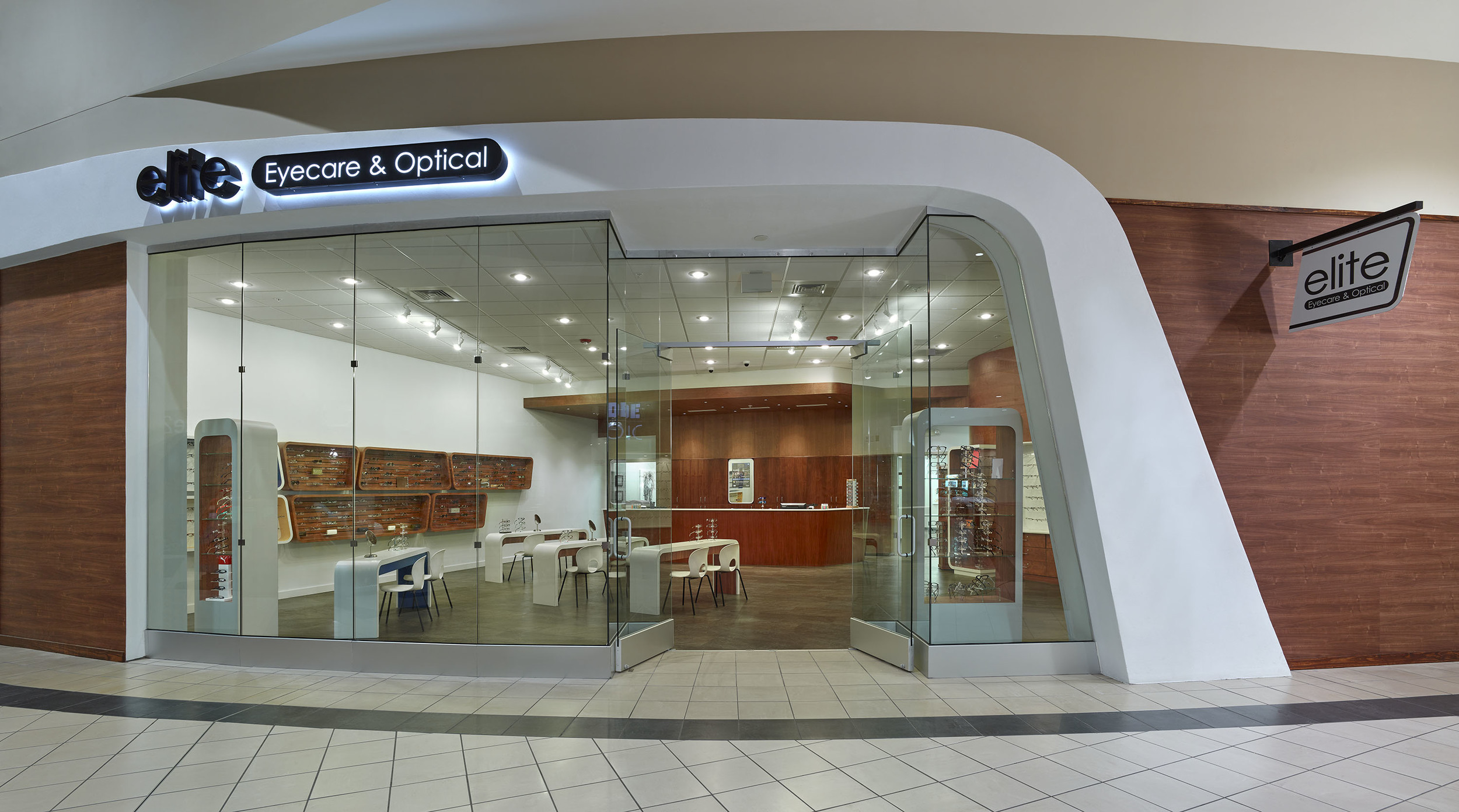
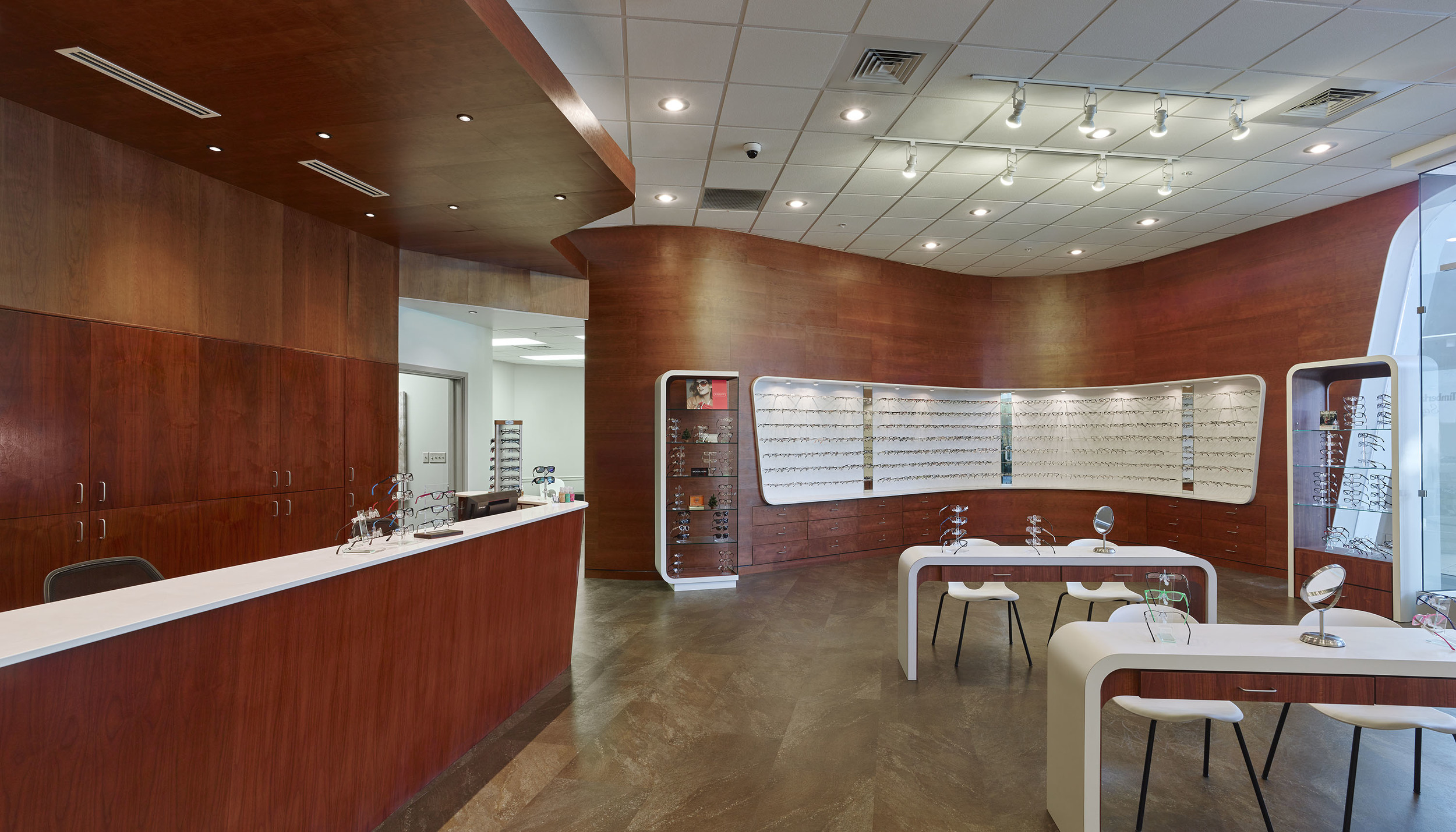
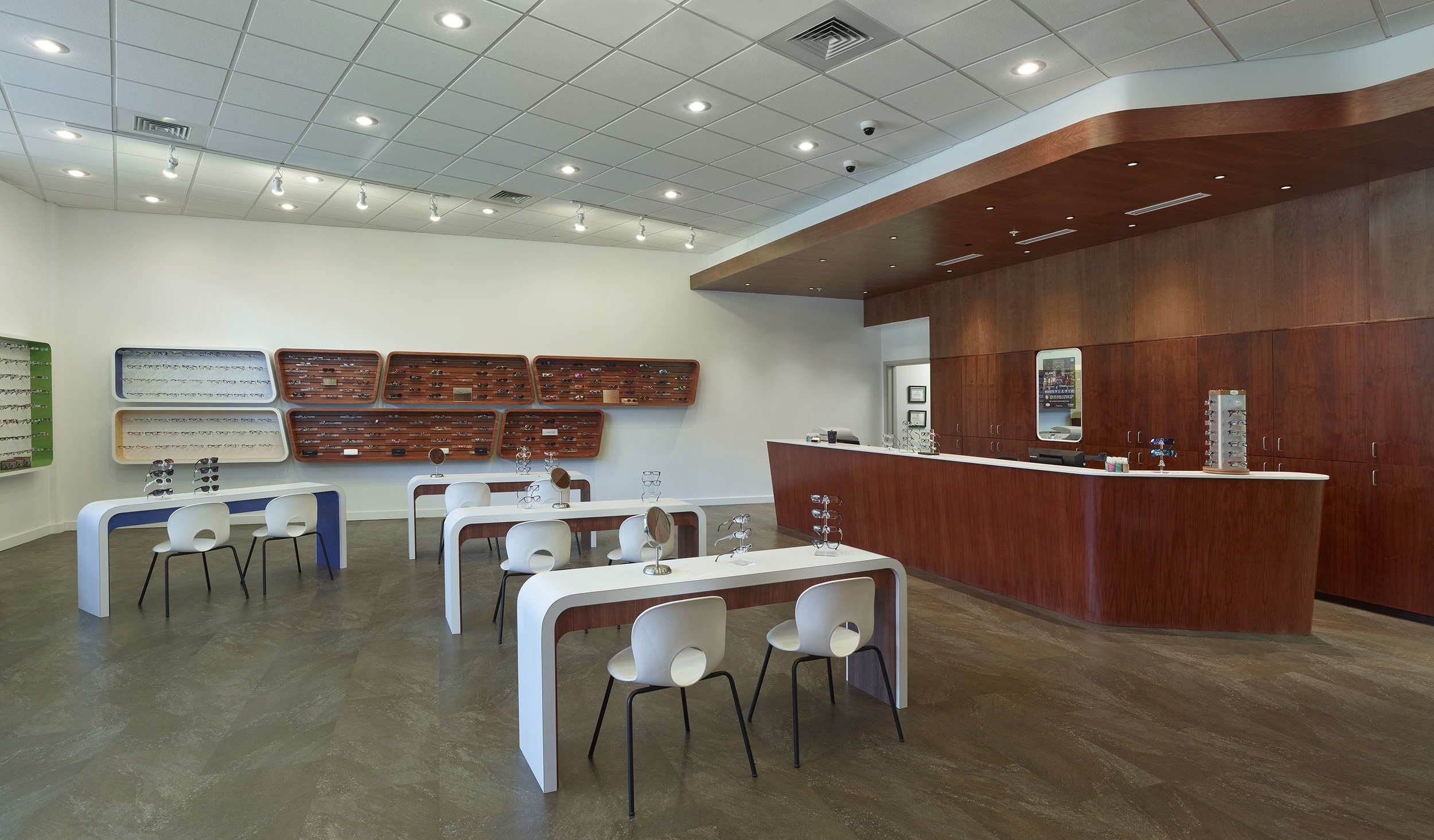
Architecture conventionally contains use, but it doesn’t often look like how it’s used. This project does. Elite Eyecare + Optical presents the form of its familiar objects as a huge fragment in space. More than merely exaggerating the scale of an object into the size of a building, this project scales up the temple piece and lenses of a pair of eyeglasses to its appropriate use. The profile over the entrance defines entry and signifies the space’s retail function to customers in the mall concourse. Another temple piece is extruded upward to make a reception counter. The profile of a temple piece extruded in section above this counter defines the reception space from above. This project presents dual characteristics of materials and poche. White retail displays (which resemble lenses) are subtracted from a rich and dark walnut wall on one side of the retail space. On the opposite side, walnut displays are applied to a soft white wall surface creating balance between the two. Similar to the products that are showcased, every chair, table, counter, and display case have been designed with the same ergonomic care.


